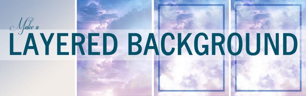
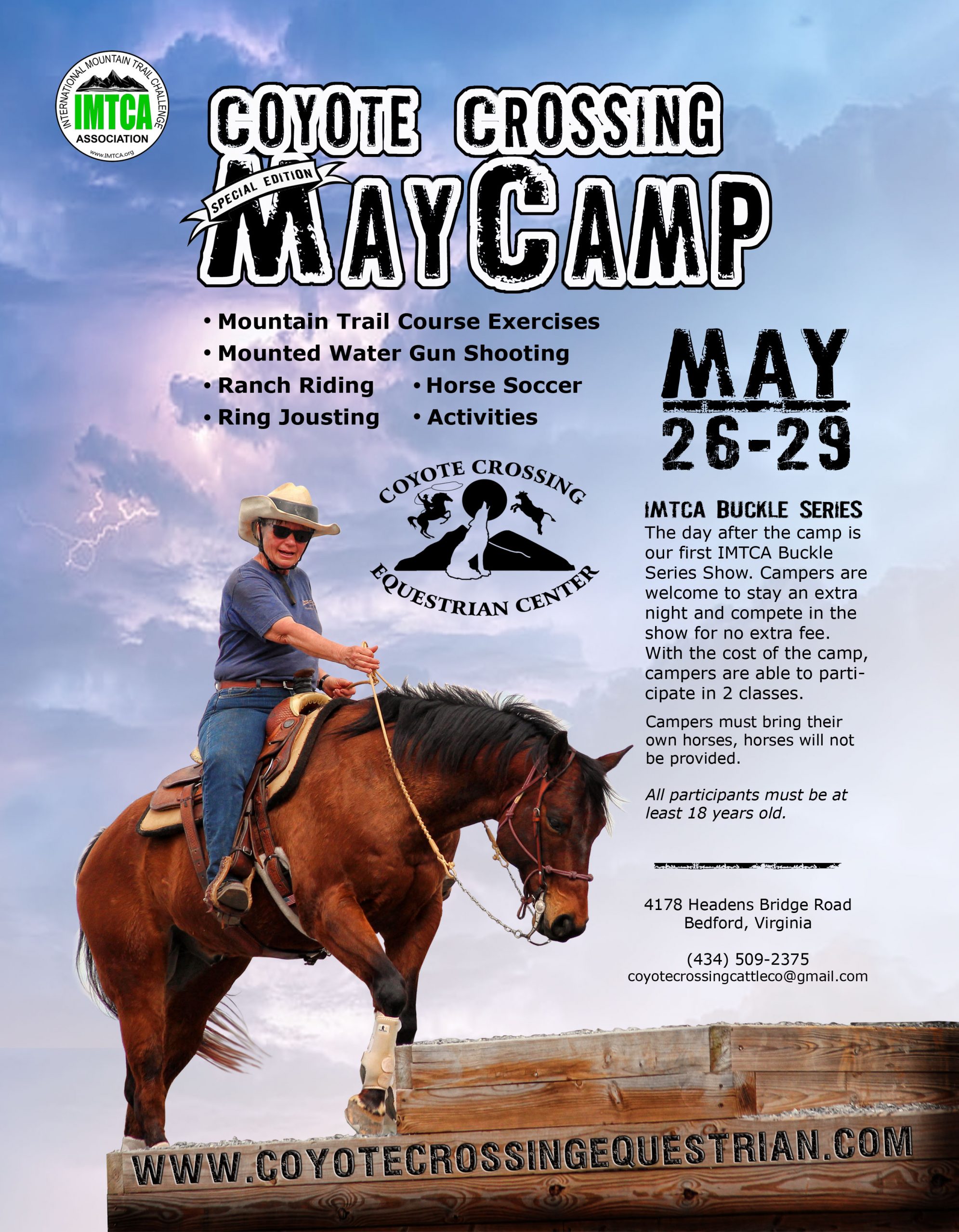
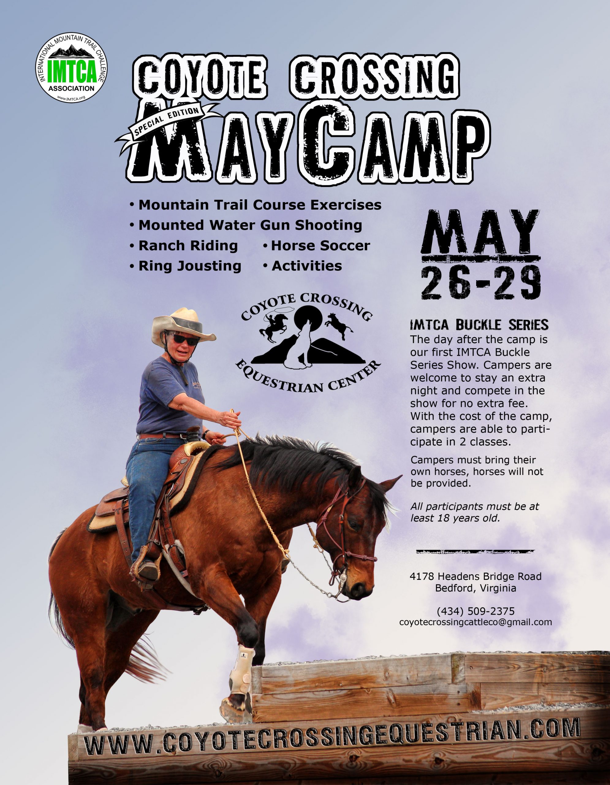
BACKGROUND LAYER ONE
First, a gradient layer with colors working with the primary subject; in this case, the horse and rider. Good, but bland! So let’s find something to spice things up. As we continue through the layers, I’ll only show the foundation background gradient with the layer being discussed on top of that, with all other layers hidden, so you can see each layer one at a time.
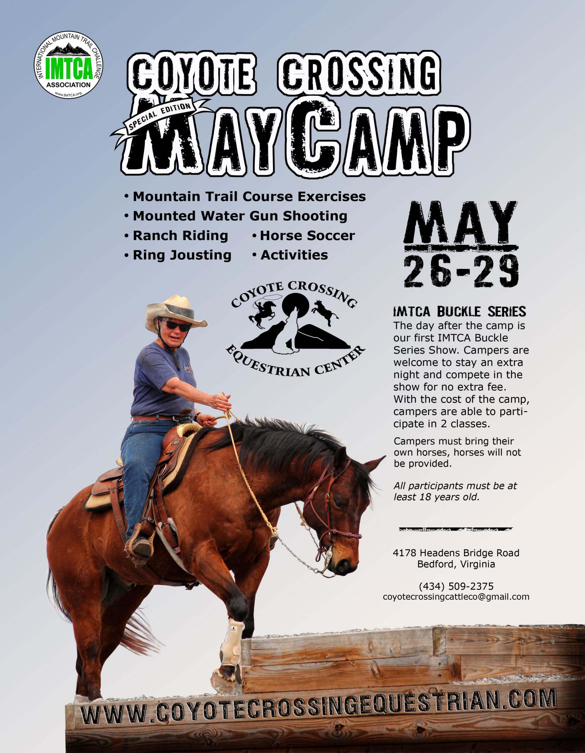
BACKGROUND LAYER TWO
So I found this image of storm image in a free backgrounds site. I had to do some cutting and smoothing to make the optimal positioning of light and dark areas according to my subject. However, while the storm clouds are exciting, they don’t really work in this setting, as no horse person would feel safe competing on their horse in the midst of thunder and lightening! Additionally, I did not fully remove the background of the horse’s mane as I wanted the natural flow of individual hairs to be present, so I decided I would simply adjust my background lighting to accommodate this, and with the correct light it will not be evident that the background around the mane was not completely removed.
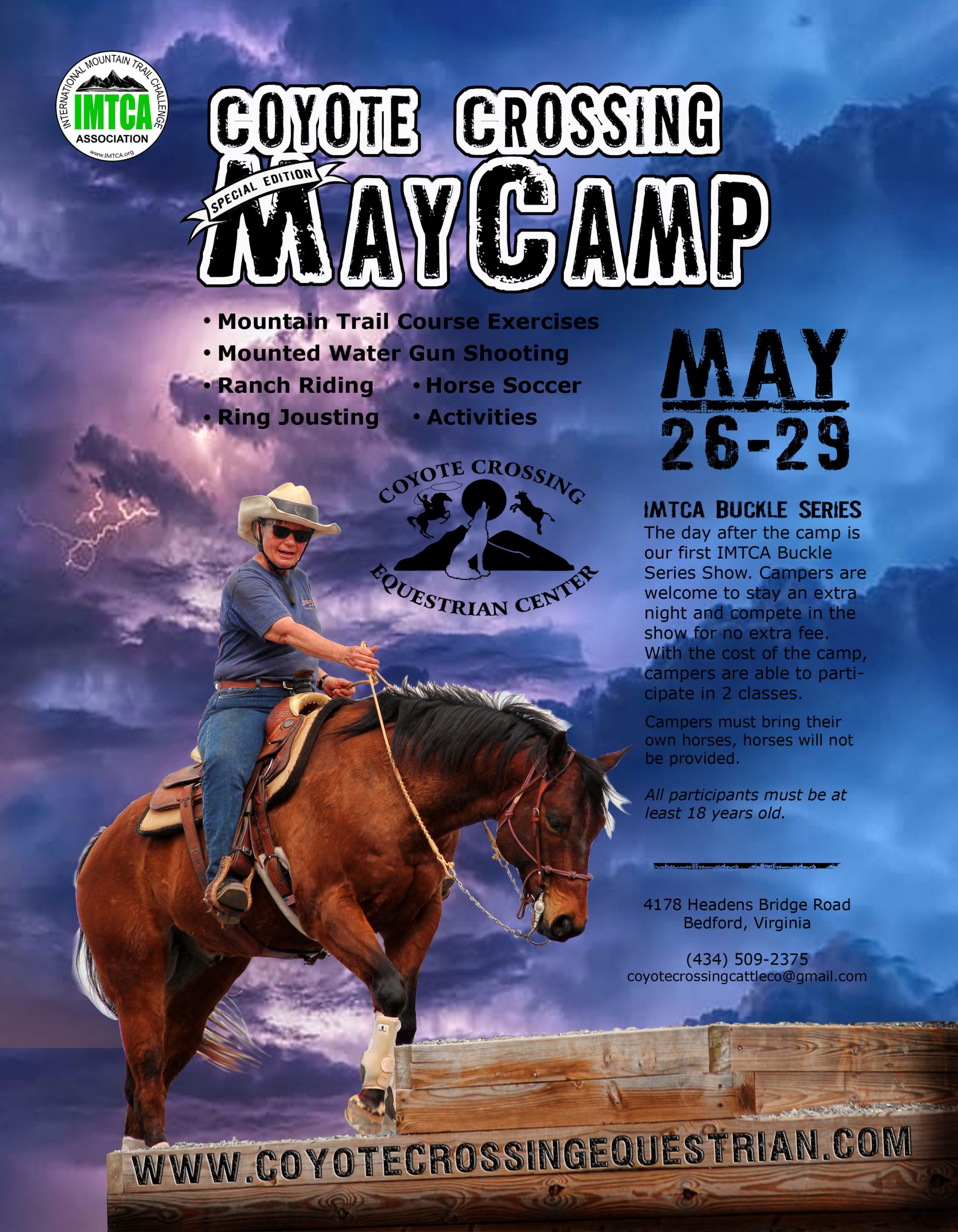
BACKGROUND LAYER TWO – ADJUSTED
At this point, I set the thunderstorm layer to OVERLAY 100%, so you have a touch of the drama without the threat, and the mane is beginning to appear as I’d like it to. Still not there!
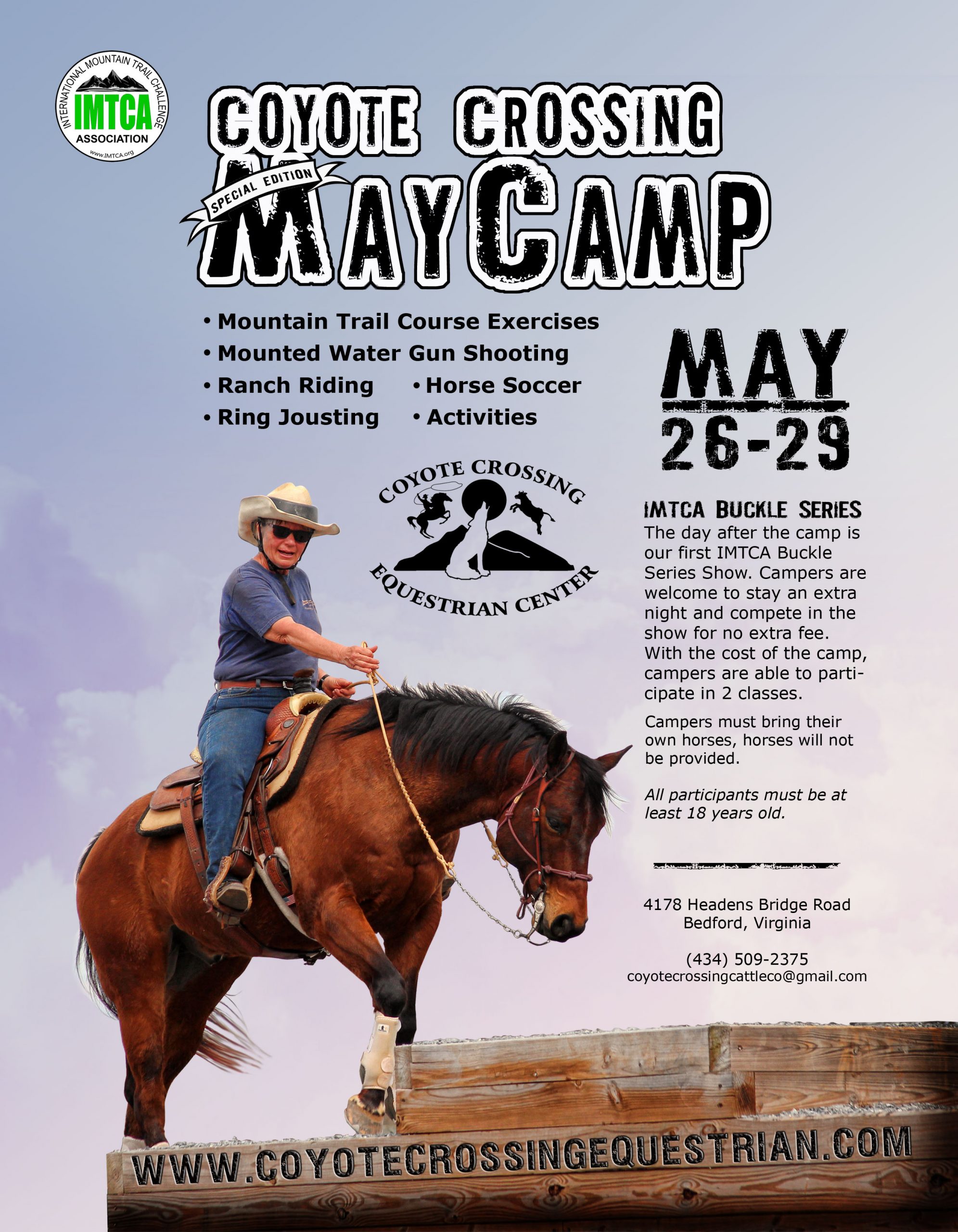
BACKGROUND LAYER THREE
I wanted to soften the clouds a bit, just a bit, so I found another free image of fluffy white clouds and laid this layer in, on top of layer two. I set this layer to COLOR BURN 100% so it would pick up the colors of the layers beneath it while subtly softening the thunderstorm.
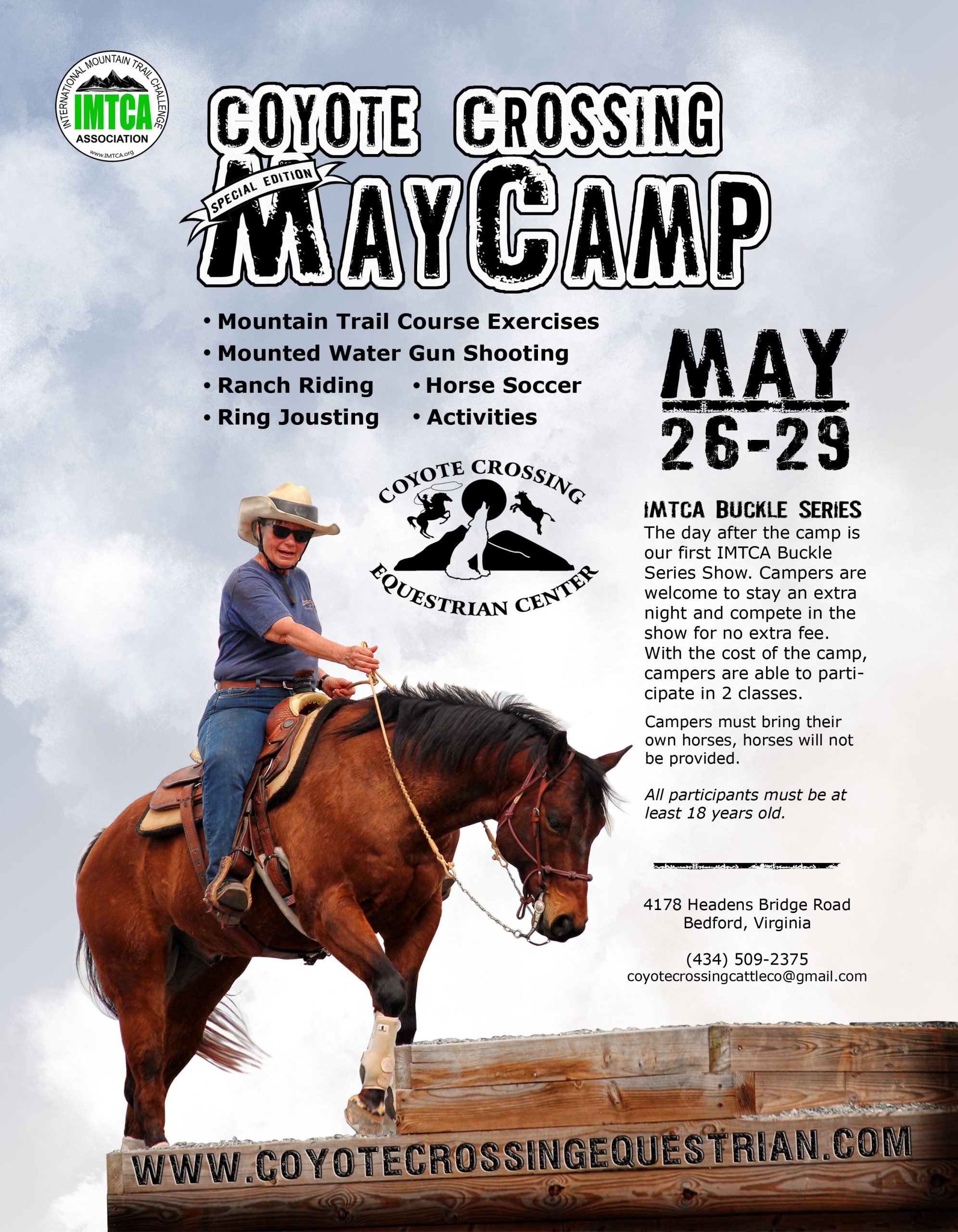
BACKGROUND LAYER FOUR
Yet another image of fluffy, white clouds set in, to lighten the background to enable text to show up clearly while continuing with the efforts of a dramatic yet subtle background full of depth. This layer was set at COLOR DODGE 100%.
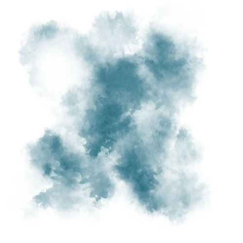 BACKGROUND LAYER FIVE
I desired a little more color in a few of the areas so I created a layer and chose the shade of purple I felt was needed, and I hit the layer with a couple of pounces with the paint brush. I am sorry that I do not know the name of the brush, but it creates a splat that looks like this (see the photo right). I used a huge brush and only hit the layer two times with it. This was set to NORMAL 50%. Nice, but still not there!
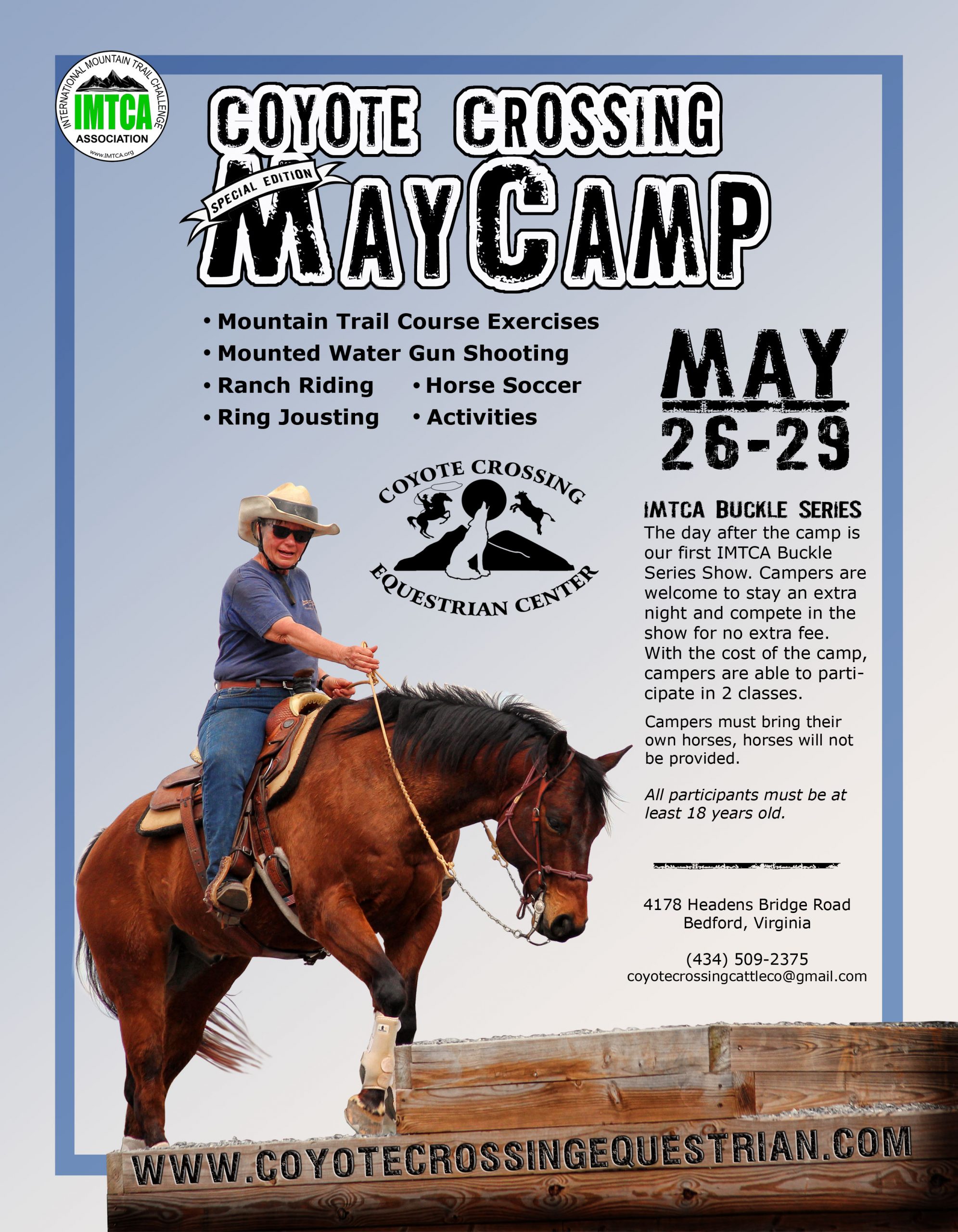
BACKGROUND LAYER SIX
At this point, I felt the image needed some sort of a border. I created this one out of the predominant shade of blue, and then set it to MULTIPLY 100%. It’s there without being over bearing, and the translucence allows it to dance around the underlying colors a bit. So close!
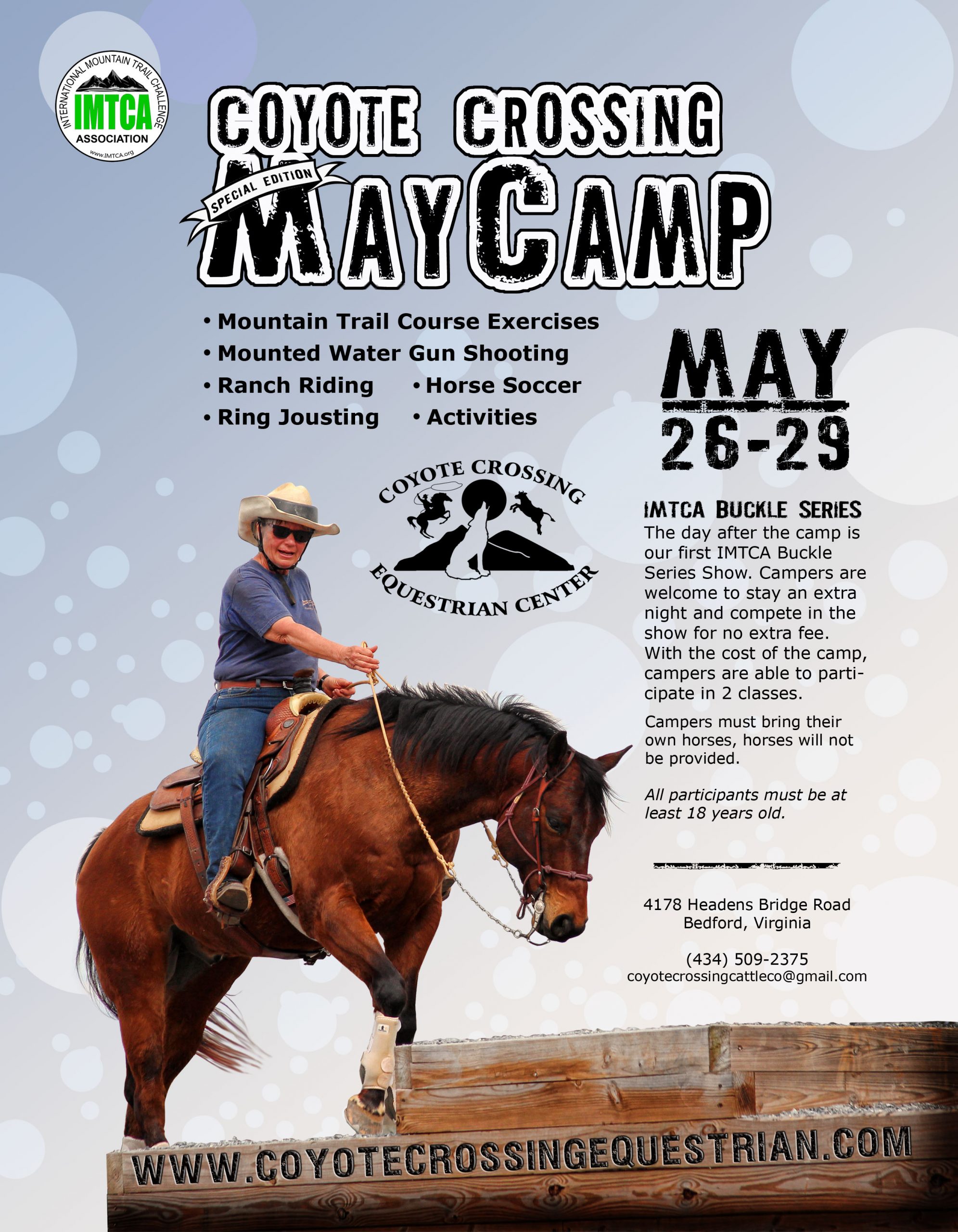
BACKGROUND LAYER SEVEN
I loved where everything was going but felt it still needed a small touch of “magic”. So, let’s make some bubbles! These bubbles were painted in white and blue and scattered about. Notice the strategic bubbles under the mane and tail? They are going to aid in making the white background in the mane and tail totally disappear. This layer was set at SOFT LIGHT 100%. I think we’re there!
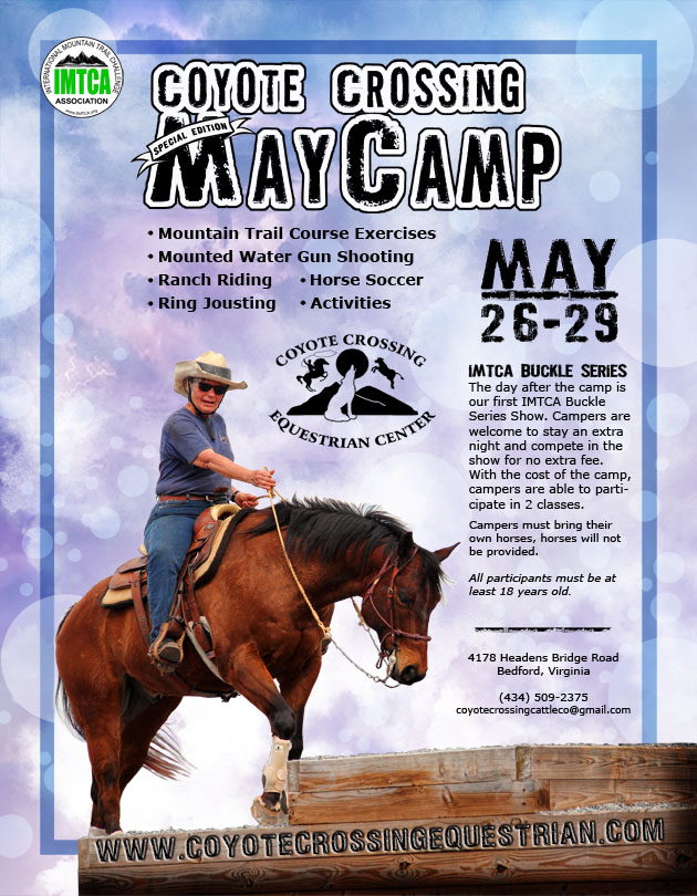
ALL THE LAYERS COMBINED
Considering that a background should make allowances for your necessary text to be easily read, while at the same time it should serve to draw interest, flatter the subject, and create an overall emotion you are aiming for. In this poster, I was aiming for joy, drama and magic… all at the same time. But subtly! It can be a tricky balance sometimes.
In the end, I am pleased with how this background turned out and it was a lot of fun to create and see it evolve.